
Using Conditional Formatting in Excel
Introduction
Conditional formatting is a powerful tool for visualizing data. With this feature, you can apply formatting to cells based on specific values, conditions, or other criteria. With this, you can spot trends and patterns in data very quickly.
No matter if you want to track sales performance, do proper project management, or monitor financial data, conditional formatting will change the way you interact with and interpret your data. We will explore in the below short article, what conditional formatting is, and how to use it properly to get the best and most out of this feature.
What is Conditional Formatting?
Conditional formatting in MS Excel is a feature that, once defined by the spreadsheet creator, applies formatting to cells based on their value. With this feature, the user can immediately identify important information or trends.
Typical use cases for conditional formatting are:
- Highlighting top or bottom values.
- Identifying outliers or errors in data.
- Tracking deadlines and project milestones.
- Visualizing trends in financial data.
Getting Started with Conditional Formatting
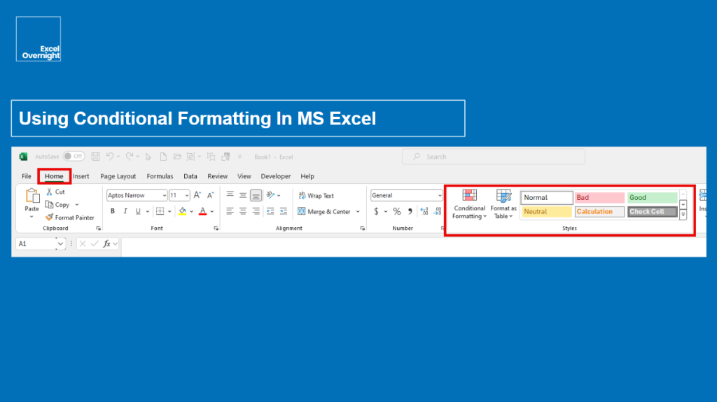
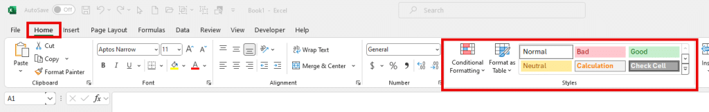
You can access the conditional formatting via the Styles Group in the Home Tab of the MS Excel Ribbon.
Accessing Conditional Formatting
- First, you need to select the cell range where you want to set up conditional formatting rules.
- Second, you go to the Home Tab on the Excel Ribbon. In the styles group, click on “conditional formatting”.
- Third, you choose a rule. You can select predefined rules in the dropdown menu, or you can create a custom rule.
Basic Formatting Options
The basic predefined rules in the conditional formatting menu are:
- Highlight cells: Typical use is highlighting greater than >, less than <, or equal = to a specific value.
- Top/bottom: You can highlight top or bottom percentages or values.
- Data bars: When you work with colored bars, you can show values relative to others.
- Color scales: You can set up a color gradient based on the values. Different shades work well when you want to show high, medium, and low values.
- Icon sets: You can use different icons like arrows or traffic lights based on values.
With those tools, you can efficiently present your data by showing key figures and trends in a professional way.
Advanced Conditional Formatting Techniques
While for beginners or a quick shot, the predefined conditional formats are fine, as you are getting more advanced, you will want to explore more conditional formatting techniques for deeper data insights.
Custom Formatting Rules
Using Formulas:
Oftentimes, more complex spreadsheets are built with formulas to create custom conditional formatting rules. A good example would be to highlight all sales figures above the average of the entire dataset:
- Select the cell range (In our example it would be A1 to A100).
- Go to “conditional formatting”, then “new rule”, then “use a formula to determine which cells to format”.
- Enter the formula “=A1>AVERAGE($A$1:$A$100). -> Adjust the cell range in the brackets to fit your data set.
Combining Multiple Rules:
Even multiple conditional formatting rules can be applied to the same dataset. For example, a green color scale for high values and additional an overlay with a data bar to show the progress. For those multiple rules, you need to use the “manage rules” option. There you can prioritize, edit, and delete rules as you want.
Using Conditional Formatting for Data Visualization
Heat Maps:
A very popular and effective way to visualize data intensity is the so-called “heat map”. A heat map shows where values are concentrated. When we stay on our examples with the sales data, a heat map can quickly show regions or cities with the highest and lowest sales by color and color intensity.
Progress Indicators:
Progress bars are very popular in the day-to-day work of many corporations and businesses. In project management, data bars with integrated progress indicators can visually represent the completion percentage of the various tasks. So, with this feature, as a project manager, you can see immediately which tasks are on track and which are not.
Icon Sets:
Traffic light and arrow icons are widespread in many Excel sheets, especially in dashboards or main data sheets. As the progress indicators, icon sets can also show a project’s status and direction.
Practical Examples of Conditional Formatting
Let’s do some practical examples across different use cases of conditional formatting below.
Sales Performance Analysis
- Highlighting Top-Selling Products: A top 10% rule would be a good fit.
- Identifying Sales Trends: A color scale rule for monthly sales figures will do the job.
Project Management
- Overdue tasks: A red fill for any tasks behind the deadline.
- Project progress: Data bars for showing the percentage of completion for various tasks.
Financial Data Monitoring
- Deviations: Red fill for any financial transactions deviating significantly from the average.
- Budget vs. Actual Expenses: Two-color scale for comparing actual expenses versus budgeted amounts. Green color = under budget = OK. Red = over budget = Not OK.
Tips and Best Practices
I know what you’re thinking, and you are right. I talk too often about simplicity and keeping it simple. But this is really key to be a good presenter and a good spreadsheet creator. There is no point in overwhelming your audience or users with too much complexity. You will do a good job when you reduce complexity as much as possible without losing the key insights. This is the art behind a good spreadsheet. So, my best tips and best practices are:
- Keep it as simple as possible.
- Focus on the key insights.
- Test and adjust your conditional formatting rules. Especially when you are new to using conditional formatting, the risk of making errors is high. So, check every rule you apply first by yourself before showing or distributing your spreadsheet.
Conclusion
With conditional formatting, you can make quicker and more informed decisions. The whole concept of spreadsheets is to collect data, calculate with them, bundle them, and visualize the results as best as possible. When done properly, decisions can be made more efficient.
Together with dashboards, data sheets with conditionally formatted cells can show you key trends, patterns, and KPIs (key performing indicators) the best.
As always, focus and simplicity is key.
FAQs
Can conditional formatting be applied to entire rows or columns?
Yes. Formulas in the conditional formatting rule reference specific cells. You just need to select the cells, rows, and/or columns.
How do I remove conditional formatting?
Select the cells from which you want to remove the formatting, go to “conditional formatting” in the “Home Tab”, and choose “clear rules”, and “clear rules from selected cells”.
Can I copy conditional formatting rules to other cells?
Yes. You can copy them by using the “format painter”.
What happens if I delete data that has conditional formatting applied?
The formatting then may disappear depending on the rule. But, the conditional formatting rule itself remains in place and will apply to any new data entered into the cell.
How can I see all the cells that have conditional formatting applied?
You can use the “conditional formatting rules manager” to view and manage all the rules applied to a range of cells.